HANDSHAKE.
A responsive hiring platform for web and mobile. Get hired. Get connected. — built to streamline the job hunt for applicants and employers alike.
A responsive hiring platform for web and mobile. Get hired. Get connected. — built to streamline the job hunt for applicants and employers alike.
Handshake — originally Hire Meet — is an employment-discovery platform built to give people the tools to land their dream job, across web and mobile.
Job hunting is slow, repetitive, and discouraging. People scroll endless listings, apply into silence, and stumble onto outdated posts for roles already filled. Across desktop and phone, the experience rarely feels like progress.
The opportunity was to make the search feel active and in-hand — surfacing the right roles, making applying fast, and giving people a way to track momentum instead of losing it.
How might we design a job-application platform that optimizes the experience, encourages engagement, and streamlines applying for both applicants and employers?
There's no shortage of job-search apps. So I started by understanding how people actually run a search — and where the existing tools let them down.
Open to all job seekers aged 18 and up — early-career through experienced.
Responsive design for both mobile and desktop — one experience, every device.
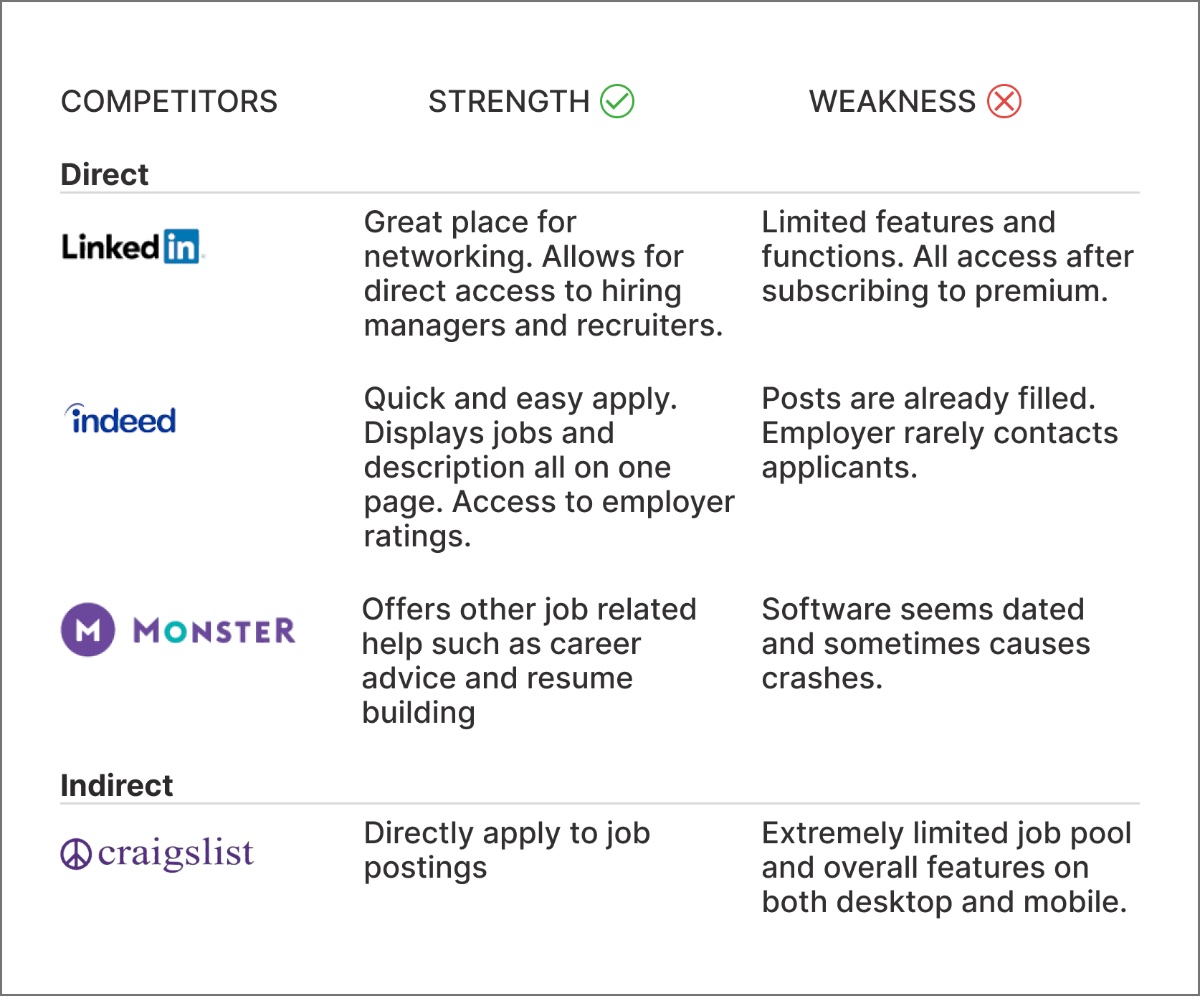
LinkedIn, Indeed, Craigslist, and Monster — audited for what works and what doesn't.
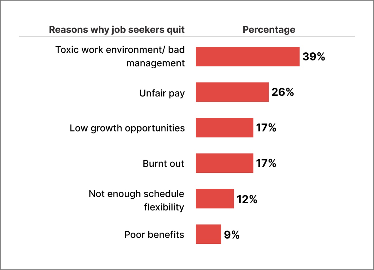
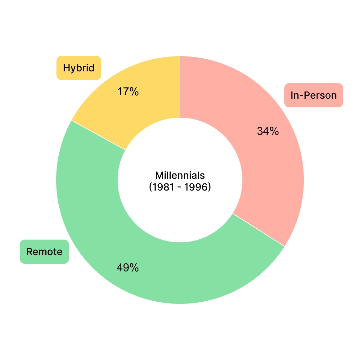
I collected existing research on employment and unemployment trends. Three objectives framed the dig.
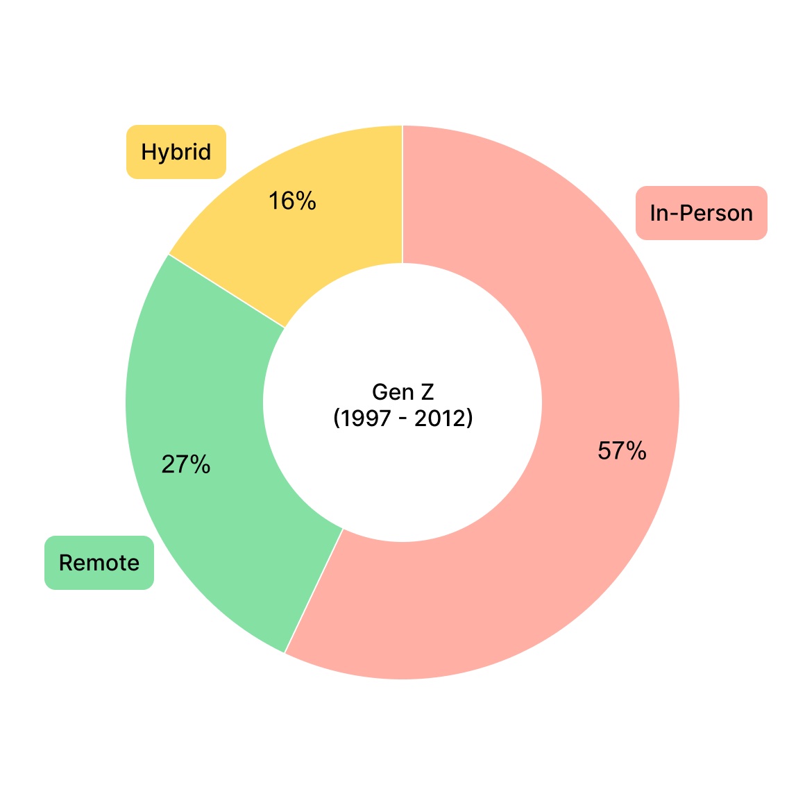
I ran an online survey on work preferences and split the results by generation. Two questions anchored it — each rated 1 to 5:
How satisfied are you in your current role?
How comfortable do you feel about your job security?
With the landscape mapped, I wanted to hear what's missing. I sat down with 8 participants, ages 22–34, to understand how they manage their job search.
“Job searching can be so time consuming.”
“I see a lot of outdated posts — sometimes I apply and the job's already filled.”
“I'm not satisfied in my role, but I'm too nervous about getting back in the market.”
“Recruiters rarely get back to me.”
“Distance is important to me.”
“I research the companies I'm applying to.”
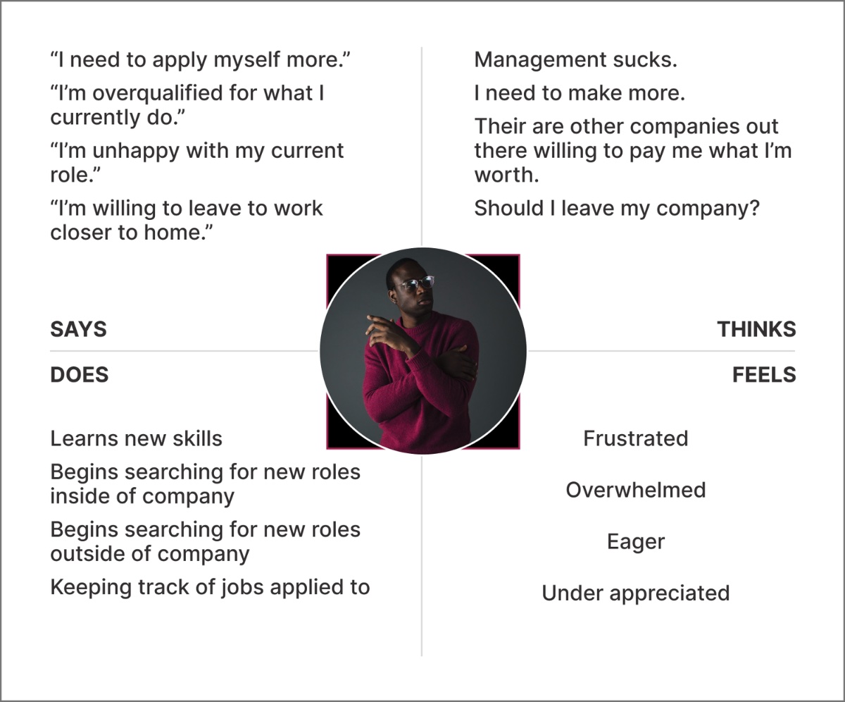
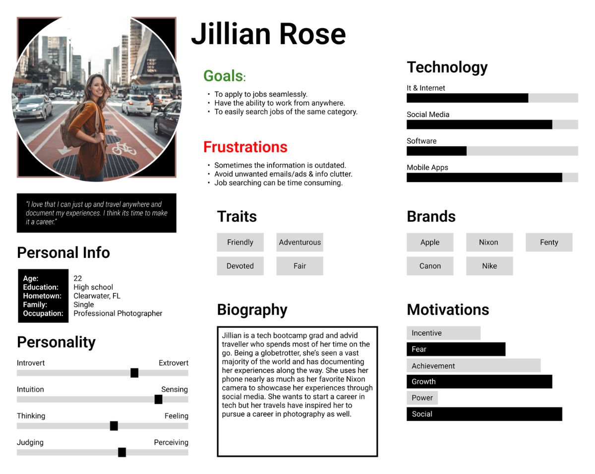
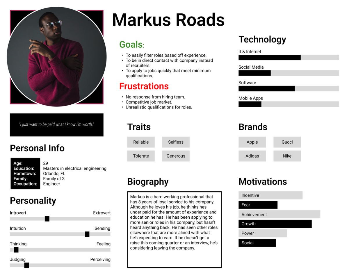
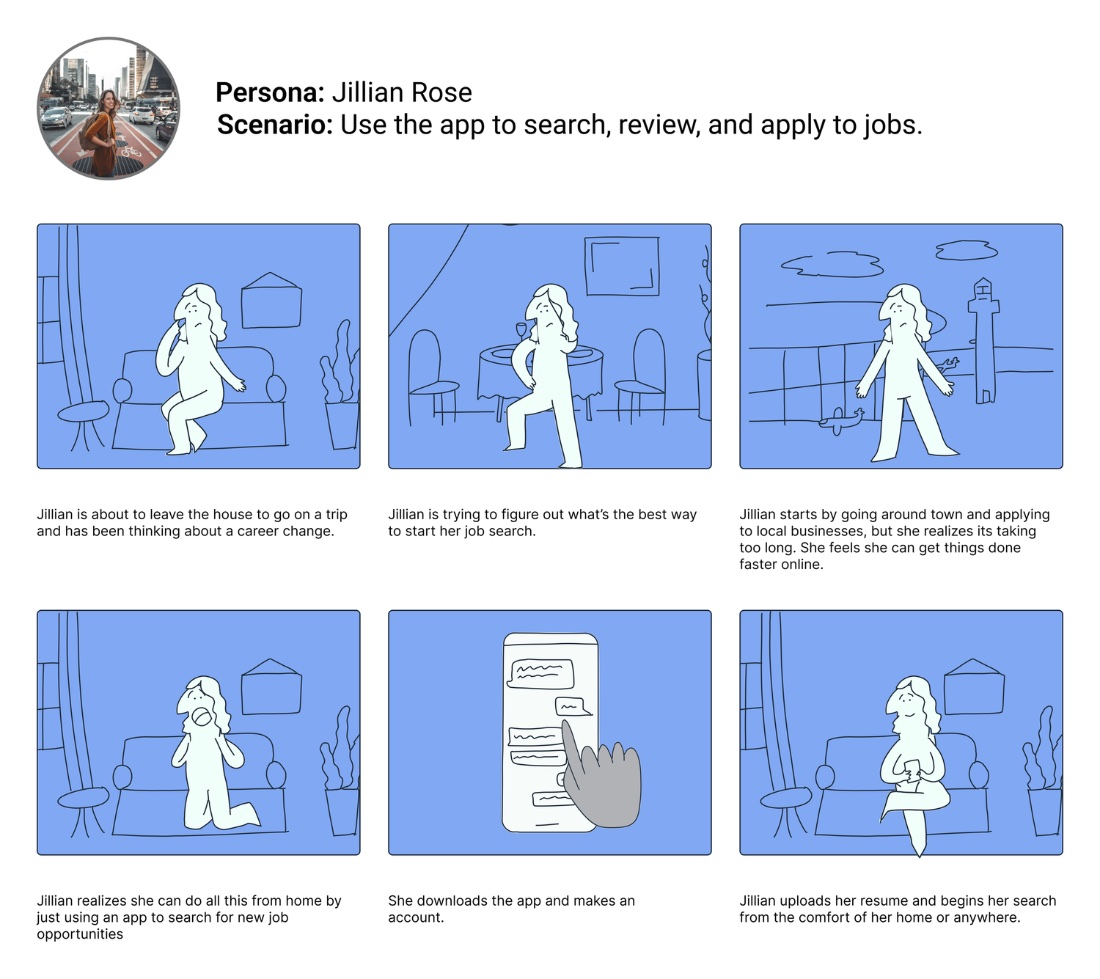
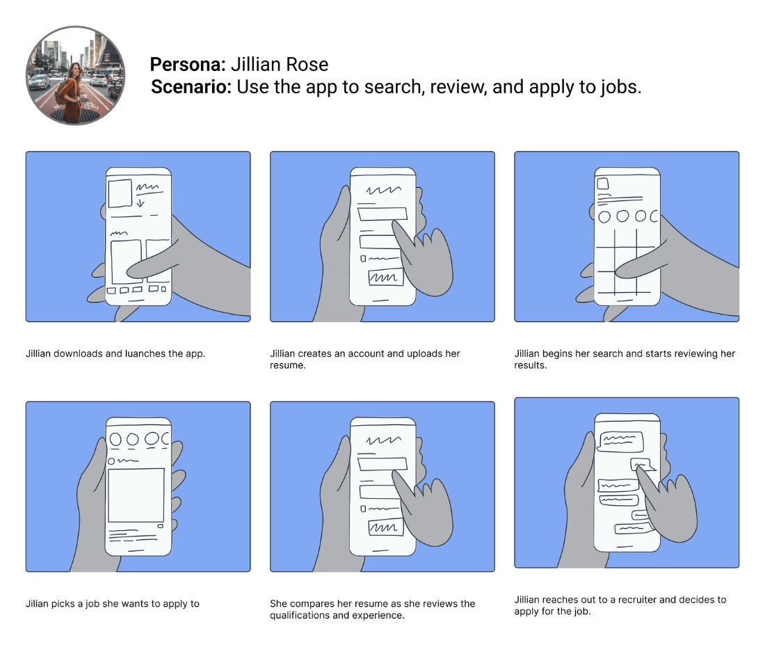
I synthesized the research into empathy maps and personas, then storyboarded how the product would actually fit into someone's search.
Empathy maps organized each user's pains, goals, feelings, and thoughts into a single view.
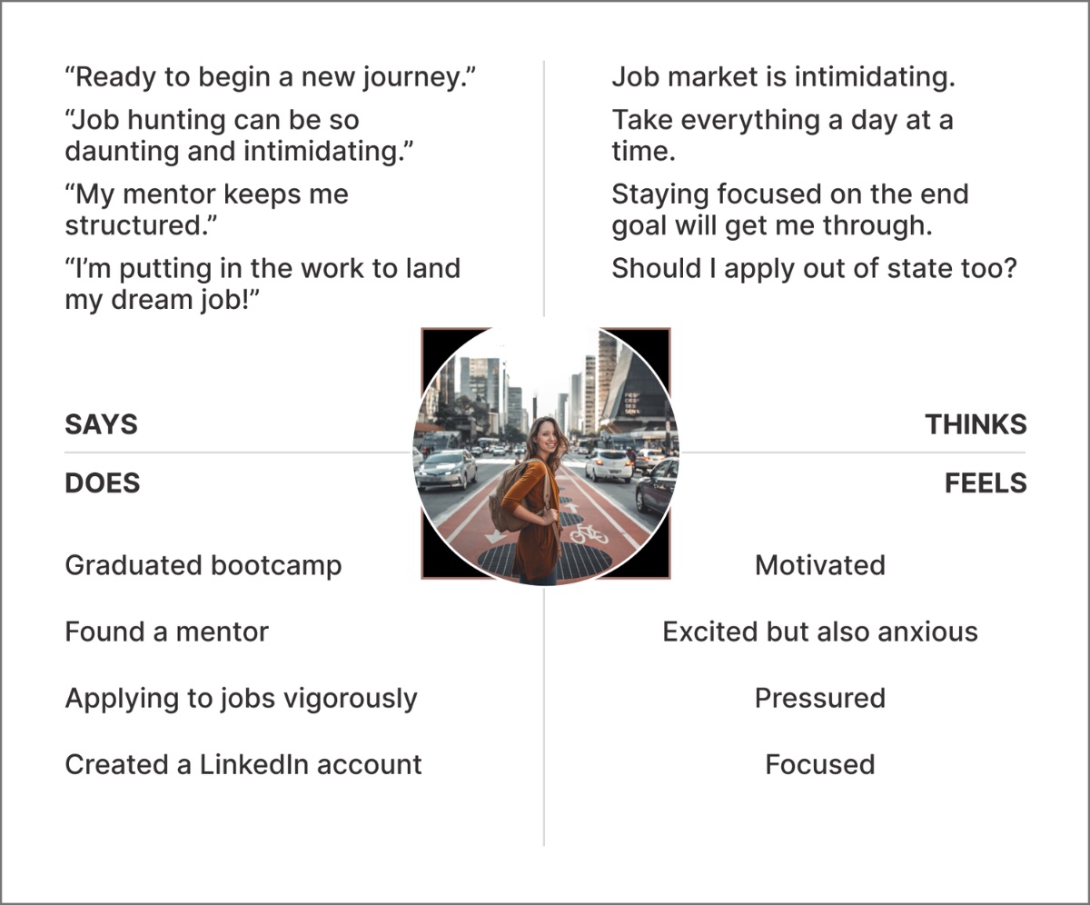
Two personas represented the audience and kept real people at the center of every later decision.
Two storyboards mapped the experience from opposite distances — the big picture and the close-up.
With the problem framed, a single How-Might-We focused the build — and a tight MVP kept it honest.
How might we design a product that helps users locate and apply to jobs with ease?
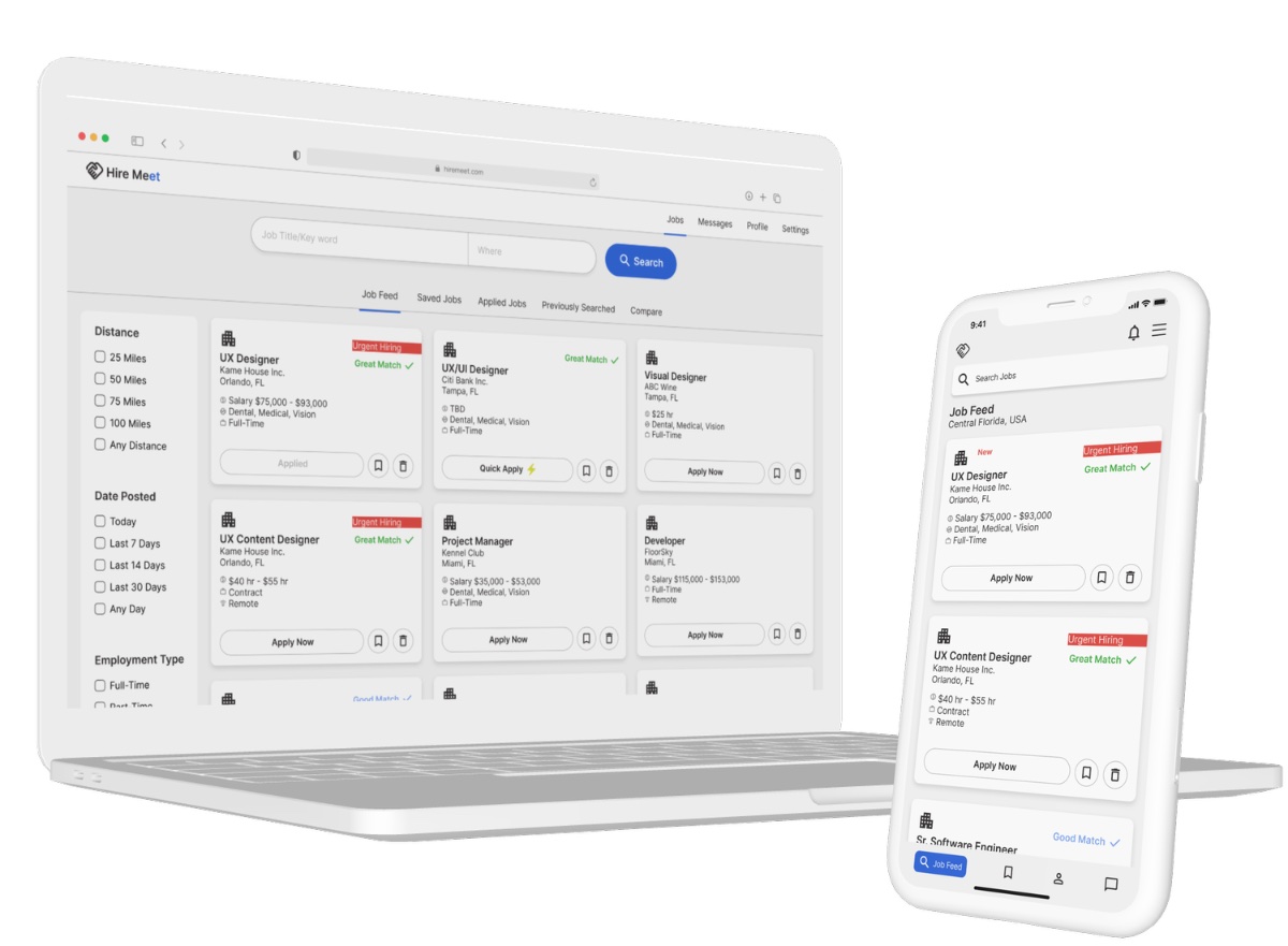
A clear, scannable snapshot of every role at a glance.
Narrow by what matters — distance, type, and salary.
Follow every application through its stages.
Set alerts for the roles you actually want.
Know the moment a fitting role gets posted.
Apply in a tap — before the post goes stale.
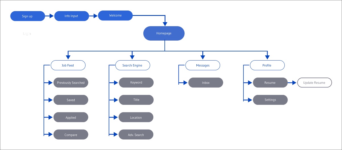
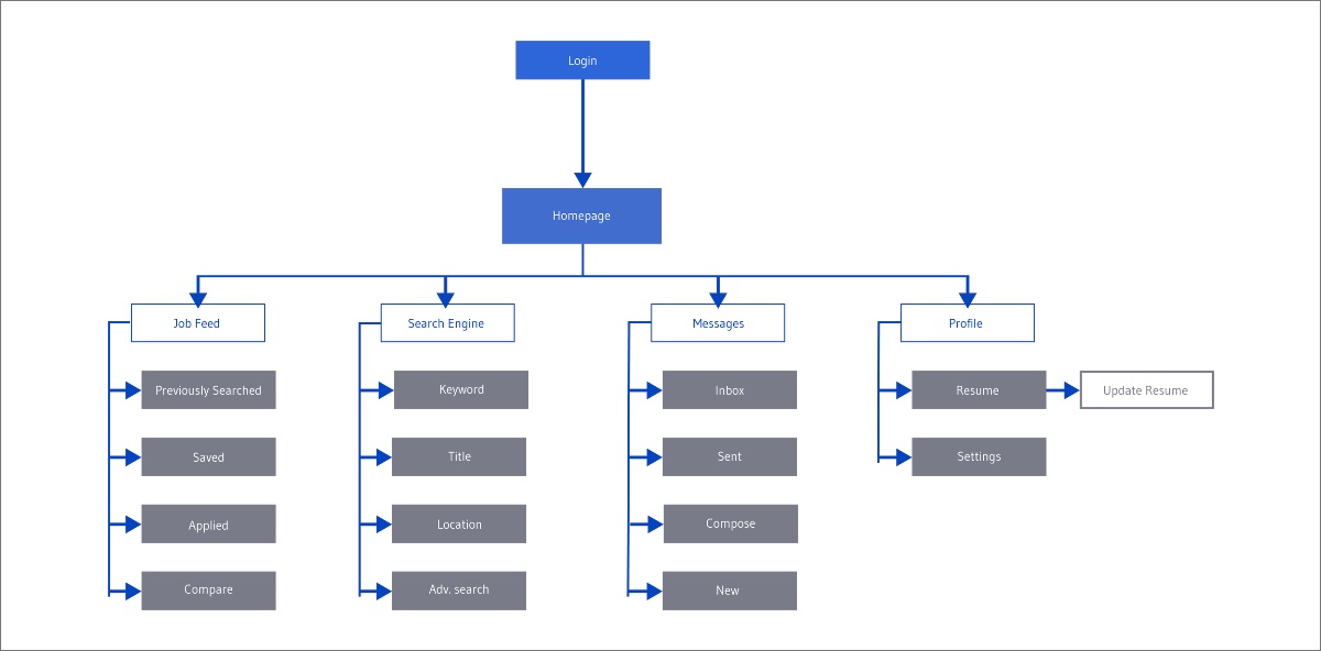
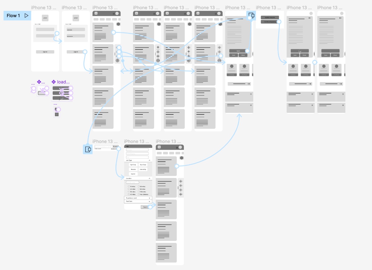
I built two flows — one for new users, one for returning — to trace the entry point and how someone moves through every feature.
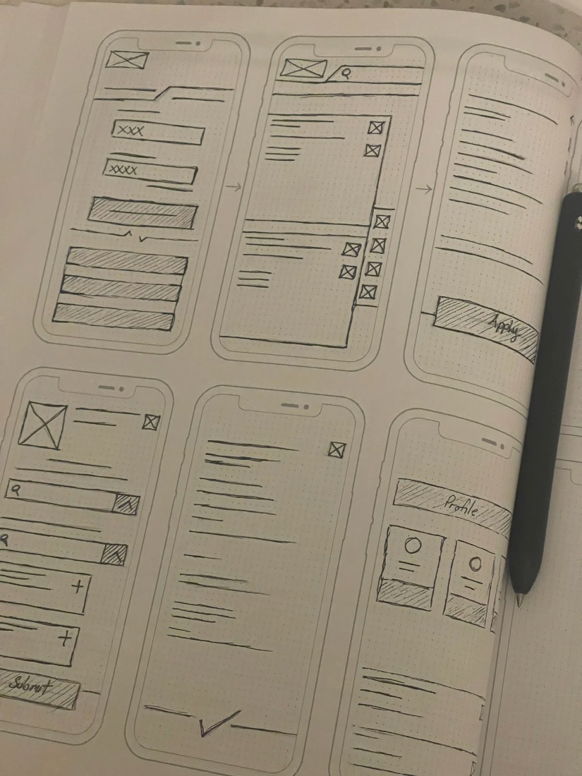
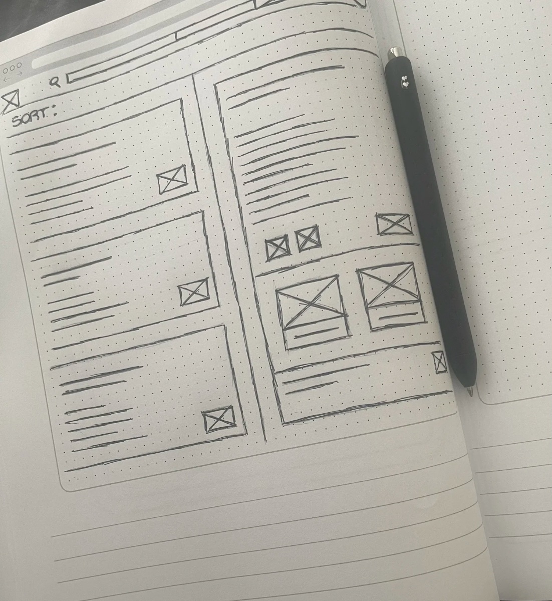
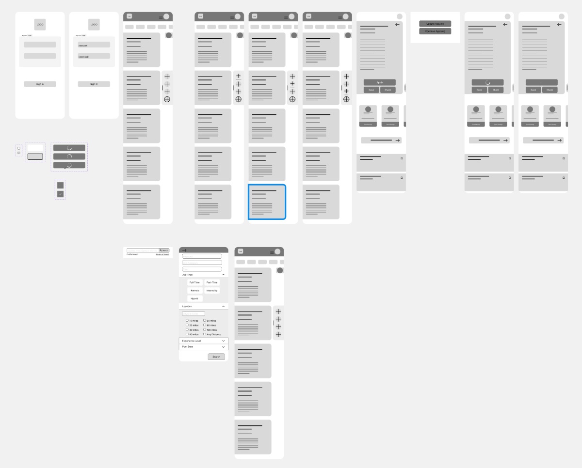
Guided by the user flows, I sketched the main screens for both mobile and desktop, then built low-fidelity wireframes and prototypes for the first usability study.
The first study was blunt and useful:
I documented the system as a style guide — then a contrast audit forced a real change: I rebuilt the palette to clear WCAG AA, including a dramatic shift to the primary brand blue.
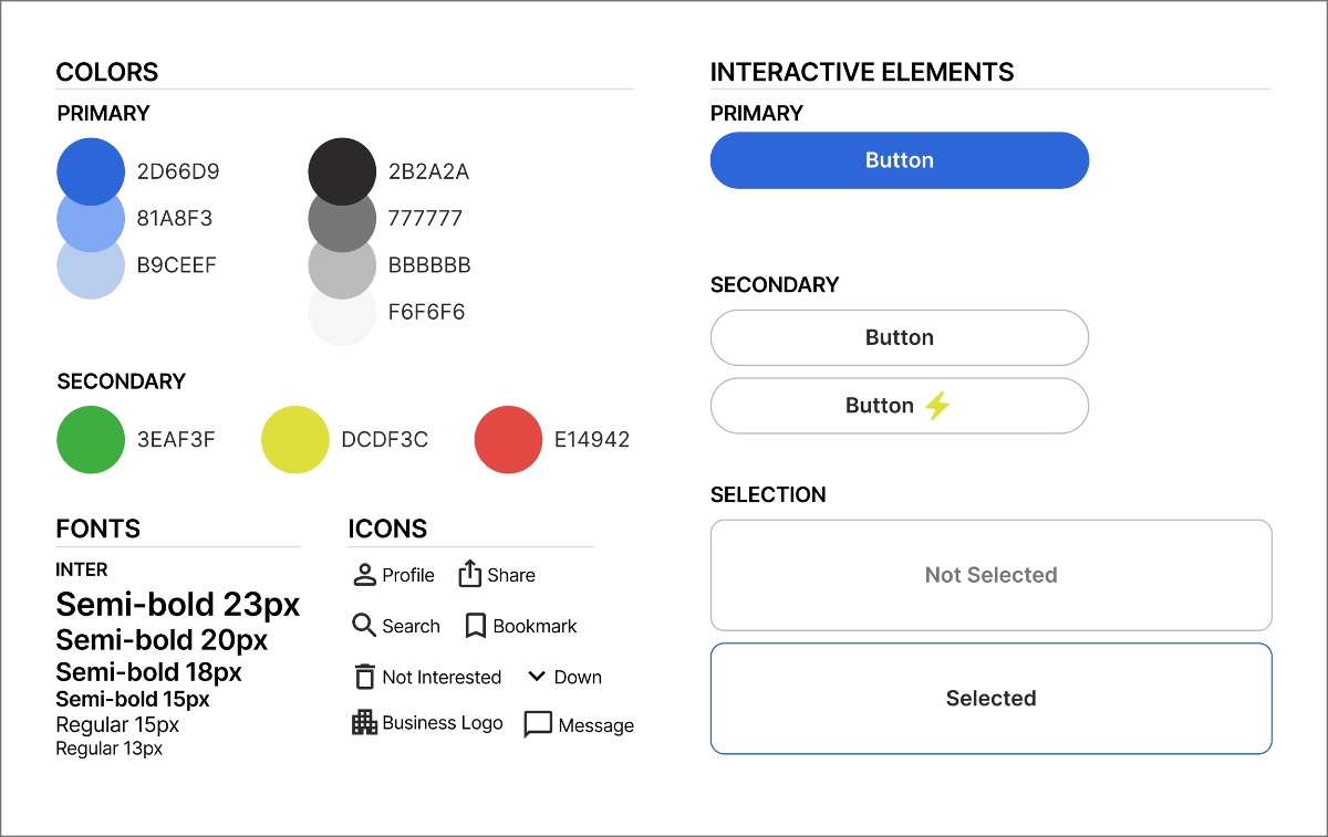
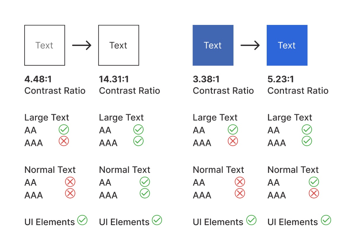
The contrast audit drove a dramatic palette change — including the primary brand blue — so core UI cleared WCAG AA.
Every text and background pair was measured against WCAG contrast guidelines and adjusted to pass.
With the system locked, I built the high-fidelity screens and a working Figma prototype — for both mobile and desktop. Try them live below.
To uncover problems I ran two rounds of usability testing with 8 participants, each completing two tasks against the app's crucial features.
Observe behavior as people navigate · see how easily they complete the tasks · surface any pain points or concerns.
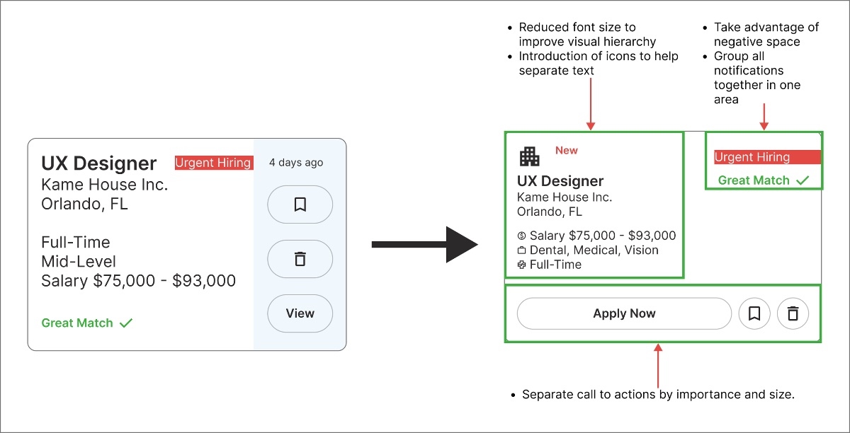
CTA too small and needs clearer distinction · highlight features & notifications more · mobile text too large · better use of negative space.
Each issue mapped to a concrete fix — resizing and distinguishing the primary CTA, surfacing notifications, tuning mobile type, and letting the layout breathe.
A first cross-platform project taught me as much about process as about pixels.
Keep the user's perspective central — it's what shapes the final design. Details matter, but don't let them halt the work.
Designing for web and mobile together changed how I scope and structure — one system, two surfaces.
There's no perfect first try. Constant testing and iteration are what move a design from working to right.
Open to full-time roles, freelance projects, and conversations about design that moves the needle.